|
|

| Review the traits of modern art. More dramatic versions of most of these traits characterize contemporary art. Contemporary art is usually defined as about the second half of the twentieth century. 1) Proliferation of new art movements. The number of schools or movements ("isms") has grown so much that virtually every year avant garde movements with new names have surfaced in the art world. One movement that dominated contemporary art for several decades was Left: Helen Frankenthaler (b. 1928), The Bay, 1963; Center: Willem DeKooning (1904-1997), Merritt Parkway, 1959; Right: Mark Rothko (1903-1970), White Center, 1950 | |||

|

|

| |
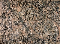
2) Subjectivity expressed through the brush stroke. The term "brush stroke" is a bit misleading, since an artist like Frankenthaler (above) "poured" her paint on the canvas (or "stained" the canvas). But many artists saw the brush stroke as an expression of the inner self. | |||

|
|
Left: Pollock painting; center: Number 1 (Lavender Mist), 1950, nearly 10 feet longClick here to see a detail of this painting. |
|
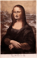
3) New definitions of art. Art is what the artist says is art. The father of this idea is the artist Marcel Duchamp (1887-1968). Duchamp was a member of an international art movement called Dada, which was essentially anti-art, protesting against all art, the art market, and the civilization which produced art. "Dada," a word picked at random from a French dictionary, fit the nihilism of this movement, for it was a reaction to the violence and political and economic casualties of World War One. For them, traditional values had been exposed and left wanting. | |||
|
This is the most famous work born of this movement. Duchamp has simply added a moustache and goatee to a commercial print of one of the icons of Renaissance art, Leonardo da Vinci's Mona Lisa and then given it a dirty title (too bad--I'm not explaining that!). So much for the great art of the past! | ||
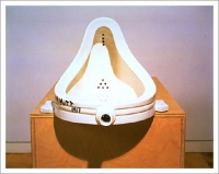
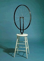
| Below are three additional works by Duchamp. His Fountain, 1917, is a wittily entitled purchased urinal, which he has signed with a funny pseudonym--a combination of the Mott plumbing manufacturing concern and the Mutt and Jeff comic strip. (You might give some thought to the differences between a fountain and a urinal and whether you would like a urinal to be a fountain!) The work in the center is entitled In Advance of a broken Arm, 1915, and is also a mass-produced object, which Duchamp has claimed as "his" art. On the right is another so-called "ready-made," his Bicycle Wheel, 1913; it is simply a ready-made stool to which Duchamp has attached a bicycle wheel. | |||
|

|
| |
Although the Dada movement was decades ago (post World War One), it was tremendously influential on contemporary art, especially Pop art. Pop artists use imagery from mass culture and the contemporary urban environment. It may be cheap and banal, but Pop artists have redefined what art is. | |||

|
Floor Burger, painted sail cloth and foam rubber, 1962 Oldenburg blows up simple items to gigantic scale and reproduces them in odd materials. He did "soft" toilets sculptures in white vinyl, a 45 foot tall clothespin in Cor-Ten steel, as well as the examples below. | ||
| Claes Oldenburg both: Giant Three-Way Plug, 1970, one in bronze, one in mahogany |
 MAS MAS
|
 | |
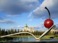
|
Claes Oldenburg and Coosje van Bruggen Spoonbridge and Cherry (model), 1988 The spoon, weighing 7000 pounds, is 52 x 29 feet. Water sprays from the top and bottom of the cherry stem. Is this art? | ||
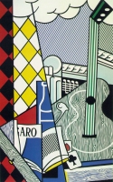
4) Reaction against tradition. It is fairly commonplace psychology these days to assume that sons rebel against the fathers, that artists (visual artists, writers, etc.--and maybe even women too!) feel compelled to revise the works of their forebears. Many contemporary artists, however, fly in the face of all traditions. Duchamp's response to the Mona Lisa (see above) is more than just irreverent. Some contemporary artists have fun doing take offs on earlier art. The pop artist Lichtenstein mocked almost every period and style in his career. Below he does his version of Cubism, an immediate predecessor, and a version of the Greek temple, an architectural form usually reverently copied in Greek Revival churches, our own Supreme Court building as well as numerous buildings throughout the world. | |||
|

|
Roy Lichtenstein (1923-1997) Cubist Still Life with Playing Cards, 1974 and Temple of Apollo, 1964 | |
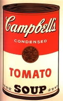
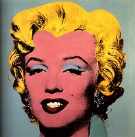
5)Anti-elistist or populist. Contemporary artists have mined new sources for their art. Rather than relying on tradition, many have embraced the ordinary, contemporary world. This is seen most vividly in | |||
|
|
Campbell's Soup 1, 1968 and Marilyn, 1964 | |
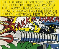
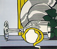
| Roy Lichtenstein made his reputation by painting large works imitating comic strips. He even used a kind of stencil to duplicate the round dots of color of early newspaper pictures. He often selected the most violent or most clichéd scenes for the huge reproductions. | |||
| Roy Lichtenstein Takka Takka, 1962 and Still Life with Glass and Peeled Lemon, 1972 |
|
| |
6) Opening up of art market. For centuries the art world had been a white male bastion. Exhibits, museum collections, and private galleries in the past few decades have begun to feature the works of women and minorities. This also means that the art these groups have sometimes made, which has been defined as "craft," not "high art," has been reappraised. These crafts include, for example, woodworking, quilt-making, china painting, making pottery, weaving, which were often practiced by women, or African Americans, or Native Americans, among others. We will look at a couple of examples. | |||
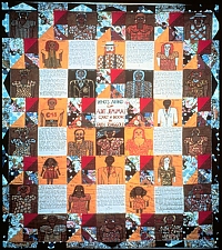
| Faith Ringgold (born 1930), Who's Afraid of Aunt Jemima, 1983, quilt and paint Ringgold became noticed during the civil rights movement of the 1960s. She initially made angry paintings, then designed large soft sculpture (like big rag dolls, including one life-sized Wilt Chamberlain), and more recently has invented a new form: story quilts, quilts that are sometimes painted on, with stories and texts. In her "dolls" and quilts, she has transformed what used to be defined as craft to high art. Major art museums have her works in their collections. These story quilts also convey a message. |
| ||
|
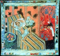
Faith Ringgold, Jo Baker's Birthday, 1993, Josephine Baker, an African American, was the rage of the French music halls. Ringgold imagines her as a strong, forceful woman (not a passive female) modeling for Henri Matisse, who no doubt recognizes her extraordinary beauty. (Recall this painting by Matisse?!) Imagining such a scene is Ringgold's way of compensating for the racism Baker endured in the United States. | ||
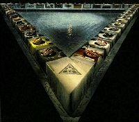
While Faith Ringgold sometimes suggests the oppression of women, many women artists counter sexism directly. One of the earliest feminist projects was Womanhouse, an abandoned house converted into a series of rooms reflecting on the lives of women. The two women who conceived this consciousness-raising project went on to redefine the art world, Mariam Schapiro through her fabric collages and Judy Chicago through her huge collaborative installations--collaboration being an important feminist principle. | |||
| Judy Chicago (born 1939) The Dinner Party, installation, 48' x 48' x 48', 1979 Chicago's aim in this famous work was to educate viewers about the accomplishments of women. She began the project as a sort of feminist "Last Supper" but expanded the place settings to focus on 39 women in history (tiles on the floor add 999 additional names). Women invited to this dinner party include Georgia O'Keeffe, Hatshepsut (the female pharaoh), Susan B. Anthony, Virginia Woolf, and many others. Each woman has a place setting with a needlework "place mat" and an individual plate. A team of almost 400 women worked on this project, and significantly, they used traditional "craft" techniques from embroidery to china painting. |
 | ||
 |
 |
Judy Chicago Mary Wollstonecraft place setting and Sojourner Truth Plate Your assignment: Who were these women? Are the place settings appropriate symbols of their lives and achievements? | |
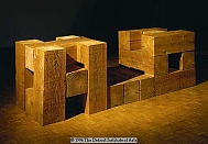
7) Sometimes contemporary art appears to be non-art or art at its most basic. The | |||
| Carl Andre (born 1935) 64 Pieces of Copper, 1969 Note that our usual assumption is that sculpture is vertical rather than horizontal. Tomb of the Golden Engenderers, 1976 |

|
| |

|

|
Sol Lewitt (born 1928) Open Modular Cube, painted aluminum, 1966 and Irregular Tower (Pecci), 1998 | |
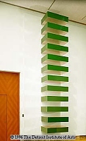
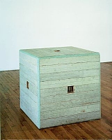
| Donald Judd (1928-1994) Stack, laminated plastic and stainless steel, 1969 and Jackie Winsor (born 1941) Green Piece, painted wood, 1976-77 |
|
| |
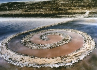
8) Anti-art world, anti-consumerism, anti-product. A number of new art "forms" developed in the 1960s and 70s, none of which were permanent objects which could be purchased by consumers or museums. In fact, some of the "earth art" was in inaccessible places, documented primarily by photos. Some of these forms include performances or "happenings" (often spontaneous events created by artists), video art, and earth art. | |||
| Robert Smithson (1938-1973), Spiral Jetty, black rocks, salt crystal, earth, red water, algae, 1500 feet long x 15 feet wide, Great Salt Lake, Utah, 1970 |
| ||
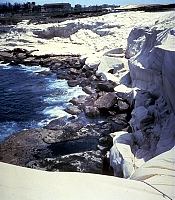
| One of the most interesting and ambitious of the earth artists (or sometimes called site artists) is | |||
|
|
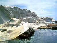
Christo Wrapped Coast, Little Bay, Australia, 1969 Christo hoped to intensify the viewer's awareness of the environment by wrapping more than a million square feet of coastline. | |
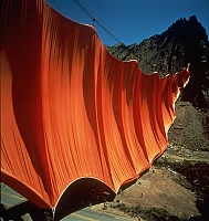
| Christo Valley Curtain, Rifle Colorado, 1970-72 Here a monumental curtain was hung across a valley. Obviously an art work like this can't be purchased, can't "belong" to anyone. |

|
| |
| Christo, Surrounded Islands, Biscayne Bay, Miami, Florida, 1980-83 and center and right: Umbrellas, Japan--USA, 1984-91 | |||

|

|

| |
|
|
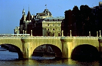
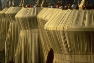
Christo The Pont Neuf Wrapped, Paris, 1975-85 This is one of the most famous bridges in Paris. Although this event was planned for almost a decade, the actual wrapping was brief. | |
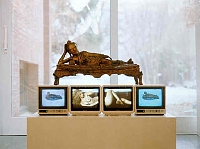
| Nam June Paik Reclining Buddha, 1994 and Piano Piece, closed-circuit video sculpture, 1993--a tribute to the avant-garde composer John Cage. The Korean American artist Paik is the foremost practitioner of video art, although now many artists are working in this new medium. |
|

| |
9) New subject matter and new media. It should be obvious from some of the preceding examples that the subjects artists deal with and the means they use continue to expand. Almost no subject, whether erotic, repugnant, or blasphemous, is off-limits, as some of the recent art controversies have demonstrated. It should be added, however, that a number of contemporary artists use their art for social purposes and that sometimes we can justify the ugliness of their art, for it can be a powerful force for good. See, for example, the work below. |
|||
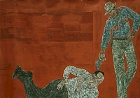
| Leon Golub, White Squad II, 1982 Golub has painted these huge scraped and rubbed canvases for several decades, protesting the Vietnam War, particularly the use of napalm, and the behavior of Americans and their allies in Central American. |
 | ||

|
George Segal (1924-2000), The Holocaust, 1982 Segal invented a new medium as well as expanding the boundaries of art. This new medium is white plaster (yes, the same kind that is used to set broken limbs). He actually cast real people for his works and often placed the figures in "real" settings. In order to make his works more permanent, some were cast in bronze. See three of his works below. | ||
Left: Cinema, plaster 1953; center: The Dancers, bronze with white patina, 1971 and 1982; right: Rush Hour, bronze, 1983 | |||
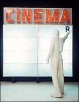
|

|
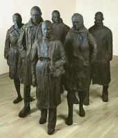
| |
Duane Hanson (born 1925) uses another new sculptural medium--cast polyester and fiberglass. Like Segal, he first casts real people, then uses the cast as a mold. He dresses his figures in real clothes, often tacky polyester prints. He paints the skin, adding liver spots, freckles, beard stubble. Even at three feet away, a viewer is hard-pressed to tell whether the figure is real or art. | |||
| Duane Hanson Football Player, 1981 and Young Shopper, 1973 |

|

| |
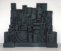
Although Segal and Hanson reintroduced realism by representing human figures, many contemporary sculptors have worked with abstractions. Louise Nevelson (1899-1988) often used "found" wood (recalling Duchamp)--scraps, furniture legs, crates--in her large works. She then repainted them a solid color (usually black), giving them a kind of mysterious presence. | |||

|
|
Louise Nevelson Rain Garden II and Sky Cathedral, 1958 | |
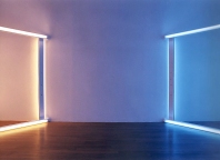
We have seen all kinds of materials used to create works of art--from earth, to plaster, to modern plastics. One last new medium is light. Some artists have worked in neon, others with fluorescent light. Below are two works by an artist who used light as his medium. | |||
| Dan Flavin (1933-1996) European Couples, 1966-71 and The Diagonal of May 25 (to Constantin Brancusi), 1963 |
|

| |
10) Humor, joie de vivre. Throughout this course much of the art we have looked at has been very serious. We have looked at important architecture which often symbolized a culture's values; we have looked at paintings used to express significant ideals. We have looked at large works where it is clear artists think they have something important to "say." Some contemporary artists take themselves and their works less seriously. The art they make can be fun. I want to end this site with some fun! | |||
| Joan Miró (1893-1983), Harlequin's Carnival, 1925 Miró, a Spanish artist, is associated with the surrealist movement, but his works, in both their titles and their imagery, are generally playful (and sometimes a bit sexy). Note, for example, the figure smoking a pipe with a goatee or the central figure playing a guitar. Cats romp in the foreground, strange beasties fly in the sky, and an ear is attached to the ladder. |

| ||
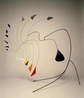
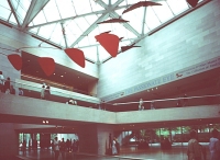
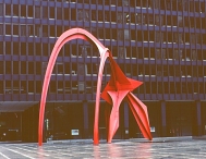
Alexander Calder (1898-1976) made playful wire sculptures for his children; then he invented the left: Little Spider, c. 1940; center: mobile in the East Wing, National Gallery of Art; right: Flamingo, 1974 | |||
|
 MAS MAS
|
 MAS MAS
| |
| Niki de Saint Phalle (born 1930) Black Venus, 1967 and Ballerine sirene, kinetic fountain sculpture, 1982-83 Saint Phalle's figures are always exuberant, in love with life. Recently she has designed a huge garden, filled with her playful people and animals. (See this site for additional examples.) |

|
 MAS MAS
| |
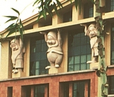
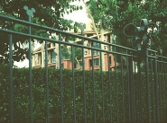
Even architects have gotten in on the act. They have realized that many of the monumental skyscrapers are cold, not user-friendly. (Remember the Seagram Building.) So post-modern architects have reintroduced color and surprise in their work. Michael Graves (born 1934) designed the Headquarters for the Disney Corporation, incorporating the seven dwarfs into the facade and Mickey Mouse in the metal fence. Team Disney Building, Burbank, California, 1991(See this site for views of the whole building.) | |||

|
|
 all MAS all MAS
| |
I want to end with a building you could all see: it's on North High Street in Columbus. You can't miss it. It is actually a grouping of buildings, each differently colored and designed (a sort of one-building-street scape) with crazy angles and oblique colored areas. Is this an inviting building? I hope you can leave this site with a chuckle. Peter Eisenman (born 1932), Greater Columbus Convention Center, 1989-93(See this site for multiple views of this building.) | |||

|

|
 all MAS all MAS
| |
All images marked MAS were photographed on location by Mary Ann Sullivan. All other images were scanned from other sources or downloaded from the World Wide Web; they are posted on this password-protected site for educational purposes, at Bluffton College only, under the "fair use" clause of U.S. copyright law.